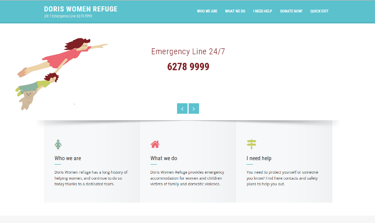
Doris Women Refuge Website

| At a Glance | |
|---|---|
| Domain | Charity |
| Type | UX research (25%), UX design (75%) |
| Skills | Interviews, wireframes, web design |
| Tools | Wordpress, HTML, CSS |
| Duration | 6 months |
Doris Women Refuge is a charitable association in Canberra that provides emergency and medium term accommodation for women and their children who are victims of family and domestic violence. They had no website, their time being entirely dedicated to helping women and children.
Their objectives
- Having an online presence that would attest to their legitimate non-for-profit, charitable status.
- Collect funds through donations more easily.
- Provide information about domestic and family violence, especially to victims.
Contrary to a typical business, Doris Women Refuge wasn't looking for more customers. Unfortunately, they almost never have any place available. A specific system is in place for victims of domestic and family violence to find accommodation, and their customers are mostly referred through this system.
Needs for Safety: Special Challenges
Another specificity of this type of associations is the need for anonymity. Businesses usually want to be clearly identified through their location, and to have a human face through the presentation of their staff. Here, because of the real risk of abuse and violence against the public they accommodate and against the employees, the location and building have to be kept secret. The staff identity can't be disclosed either, for fear of pressure and intimidation.
Visitors to the website are potentially in danger too, simply by visiting it, if they are victims of domestic or family violence. They have to be able to leave quickly the website, in case they risk to be discovered by their abuser.
Writing specifications and implementing them
Through a series of interviews, I gathered needs and information. I also reviewed websites of similar associations. I wrote down functional as well as technical specifications, including structure, navigation, contents. I prepared three different wireframes for the layout of the home page, and three for a content page.

Proposition of three layouts for the home page
We discussed this first draft, and I refined the contents based on their feedback. Regarding the layout, we settled for a mix between two of the suggestions I had done. There was already a visual identity defined for leaflets and cards, so I used the same logo and colors for the website.
Another particularity of such a small association is the complete absence of technical staff. So they need to be able to maintain the website with minimal technical knowledge and training. WordPress offered the flexibility and user-friendliness that were needed. I used an existing WordPress theme (Square by Hash Themes) which I customized to implement the layout we had chosen.
The website is ready, just in need of a hosting service to be live!
